

By Dianne Coan, Technical Operations Division Director
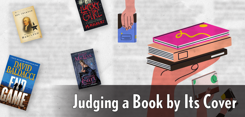
They say don’t judge a book by its cover. Although noble in theory, this is easier said than done. Covers play an important role for a book. Art on a book’s cover draws readers in and can provide insights as to what they may find among the pages. Therefore, I argue that judging a book by its cover may not be as big as a literary sin as we think. In fact, it can even be useful - if you know how to do it right.
The Big Clues
Cover artists are skilled craftspeople who work to convey all kinds of information while at the same time drawing a reader in with beautiful packaging. If you have been an avid reader (or a book selector) for long enough, a glance at the cover can often tell you a few simple facts about a book, like if it is fiction or nonfiction, what the age of the target audience may be or which genre it falls into. So, let’s go over some of the big clues a cover can offer a reader.
The most noticeable clue on a cover is almost always the title of the work itself. Sometimes it’s obvious - the title One Good Earl Deserves a Lover practically screams historical romance (fiction). Other times, the title alone is not always enough. For example, titles like Lessons in Chemistry, Spare, or The Wager could lend themselves to works of both fiction or nonfiction. In fact, they are both.
If you still aren’t sure, imagery is your next clue. Nonfiction covers tend to have photos or photo-realistic art on the books, with traditional font and colors choices. This is especially true in the case of biographies, which often have the subject on the cover.
Fiction genres tend to be a little more nuanced. Some have obvious clues, such as the “clinch covers” in romance, the “body on the ground” in mystery or the “silhouettes running” in thrillers. Other covers are more subtle, with imagery that suggests something rather than saying it outright. For example, a flower with a broken stem on a cover may hint at something going awry, maybe even horribly for a book in the mystery/ psychological thriller genre. And finally, some covers simply utilize obscure visuals and design elements like font and color to give the reader a vague sense of unease … looking at you, horror novels.
Design Choices: Breaking Down the Clues – A Real-Life Example
Let’s take a moment to apply these tips to two actual book covers, both titled Lucky Girl.
At first glance, I know which one I will be reading during the day with the lights on. I feel someone is being VERY ironic in saying this girl is lucky…I do not think that word means what they think it means. Obviously, I am talking about Lucky Girl by M. Rickert. The designer has done an excellent job of creating tension between the visual and the title words. First, the font is red - blood red. Second, the font looks almost scrawled. The letters are of varying sizes, they are unevenly spaced and the background bleeds through (pun intended). The cover itself is dark and features misty woods. When has anything good come out of the mist and fog? The perspective is set where one is standing in front of a gate. A gate that has the title letters winding through it, like overgrown ivy at an abandoned house. This is absolutely a horror book.
Now let’s look at Lucky Girl by Irene Muchemi-Ndiritu. Seeing bright colors, a city in the background and the branches of a lemon tree in the foreground, one is much less disturbed looking at this cover. The city skyscrapers make me think it’s contemporary, but it could be recent historical. The font is white, and like the other book, the background also bleeds through, though more like the first layer of paint, something perhaps not quite finished (versus something that just met its end). This cover also has a texture. Perhaps the cover was painted on fabric? Also, there are patterns reminiscent of African textiles. To this eye, the cover reads as contemporary, likely featuring a Black main character or not set in the United States, perhaps involving the fashion or textile industry and maybe featuring a girl that is, indeed, lucky.
How did I do?
Lucky Girl by M. Rickert is indeed horror. The main character’s family was “tortured and murdered” when she was in her teens (not a surprise.) The story is set at a gathering where the attendees take turns telling stories that beckon Krampus. This was unexpected, but it makes sense if I read the subtitle or understood the significance of the bell, which I might know if I enjoyed horror.
Lucky Girl by Irene Muchemi-Ndiritu is set in turn of the century New York City running through the late 1990s through early 2000s. It features a young Kenyan woman recently moved to the U.S. to attend Barnard College as its main character. The book is described as “A thoughtprovoking exploration of the complicated experience of an African woman in America” by Kirkus Reviews. I guess I would need to read the book to decide if she is, truly, a lucky girl.
Remember, It’s Not an Exact Science
Judging a book by it cover is more art than it is science. While a book’s cover can draw your attention and give you a hint as to whether you may like it, it should not be the main way you determine what to read next. Instead, treat this as a first step. Make sure to read the flyleaf or back cover of a book to confirm if your visual instincts were right and a book IS something that interests you.