

By Dianne Coan, Technical Operations Division Director
They say "don’t judge a book by its cover." Although noble in theory, this is easier said than done. Covers play an important role for a book. Art on a book’s cover draws readers in and can provide insights as to what they may find among the pages. Therefore, I argue that judging a book by its cover may not be as big of a literary sin as we think. In fact, it can even be useful - if you know how to do it right.
This is part three of our four-part series: Misjudging, by design?
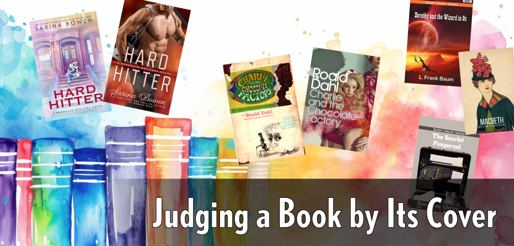
Part one of this series talked about how you could use cover clues and experience to reasonably guess a book’s genre and, often, target reader age. However, this is not always the case. There are times when a book cover just misses. It either is so detailed you have to read the book to understand the cover or worse, it misrepresents what you might find inside. Compare the original cover and 10-year anniversary edition cover of Roald Dahl’s Charlie and the Chocolate Factory. The original cover’s playful font and sketched illustration indicate the book is for a younger reader, while the anniversary cover is decidedly less clear.
One style of cover that may lead to a misjudgment is the illustrated cover. For the last several years, there has been a trend, especially in the Romance genre, toward illustrated, almost cartoon, covers. An illustrated cover in and of itself is not necessarily misleading, but many are. Take Sarina Bowen’s book Hard Hitter as an example. To date, the book has had three covers. The original mass market cover from 2017 most definitely hints at what the publishing blurb “hot enough to melt the ice” makes clear: do not be surprised to find sexy times inside. The first illustrated cover shows a couple on the front stoop of a brownstone (set in NYC) in a semiclinch. This illustration style also reads as “for adults,” and while not as clear on the sexy times point, with the way the characters are interacting, you would not NOT expect it. The Kindle cover of the book moves further down the illustrated path and has the characters standing apart and holding hands. The font is more casual and has a bit of a YA feel to it. This, coupled with no indicator at all of the sexy times inside, is unfortunately misleading and could lead to quite a surprise for someone simply looking for a cute romance to read.
It is unclear if this “cartoon-ification of covers” is a trend driven by publisher marketing; due to instances of online selling platforms removing books with covers its algorithm deems too sexy or horrific; because there is less stock photo representation of plus sized and minority models; or for some other reason entirely, but the trend appears to be sticking around and will continue to result in confusion among readers. With the unprecedented rise in book challenges happening nationwide, there is no need to exacerbate the issue by pretending to be something else.
Another example where covers can be quite misleading, or just outright funny, may happen after a work enters the public domain. Entrepreneurial souls will repackage the content, create a cover and sell it where they can, royalty-free. Often times the cover art used is also royalty-free and seldom has a direct relation to the work. I don’t recall fighter jets in The Wizard of OZ, but that would certainly be an interesting counter to flying monkeys. Why is The Scarlet Pimpernel, the dashing rescuer of aristocrats from madame guillotine during the French Revolution, carrying a briefcase with a kitten? And while an illustration of a woman from the 1920s is lovely, how on earth does it relate to the story of a Scottish general usurping the throne and make an appropriate cover for William Shakespeare’s Macbeth? Even copyrighted materials are subject to misleading cover choices. Just take a look at the Brazilian version of Stephen King’s The Shining, which reads less psychotic-murder horror and more fashion horror. Chances are many a reader has been left confused by these choices.
Whether by design or inadvertently, these examples show that while the covers of some books can tell you a lot, others may lead you down the wrong path or leave you stranded without a clue. As a rule, when in doubt or not getting any specific vibes from the cover, be sure to read the flyleaf and the blurbs and maybe even skim some pages to get a better feel if this is the right book for you.